Creating a peaceful home environment starts with the colors you choose for your walls and décor. Calm colors can transform any room into a relaxing retreat, helping to reduce stress and promote wellbeing. If you want your home to feel inviting and serene, selecting the right palette is key.
In this post, we’ll explore practical tips for choosing calm colors for your home, including how to consider lighting, pair shades, and apply colors room-by-room. Whether you’re repainting your living room or refreshing your bedroom, these ideas will guide you to a calming color scheme you’ll enjoy every day.
Why Choose Calm Colors?
Calm colors—often soft, muted, and neutral—have psychological effects that encourage relaxation and ease. Common calm colors include soft blues, gentle greens, warm beiges, and light grays. These tones don’t overwhelm the senses and help create balanced environments.
Using calm colors in your home can:
– Enhance your mood by reducing anxiety
– Make spaces feel bigger and more open
– Provide a versatile backdrop for different décor styles
– Promote restful sleep in bedrooms
Understand Your Space and Lighting
Before choosing colors, assess your space and how natural and artificial light affects it.
Natural Light
– South-facing rooms get warmer light and can handle cooler, calming colors like pale blues and mint greens.
– North-facing rooms receive cooler, dimmer light and might benefit from warmer calm tones like soft yellows or warm beiges to prevent feeling cold.
Artificial Light
– Consider the type of bulbs you use. Warm bulbs (yellow-toned) make colors appear cozier, while cool bulbs (blue-toned) emphasize crispness.
– Test paint samples in different lighting conditions throughout the day to see how the color changes.
Choose the Right Hue and Saturation
Not all calm colors are equally soothing. The tone and intensity matter.
– Pastel shades: Light and desaturated hues offer tranquility without feeling dull. Examples: powder blue, blush pink, sage green.
– Earth tones: Soft browns, taupe, and warm greys connect you to nature and create warmth.
– Avoid overly bright or dark shades: These can be energizing or heavy, contradicting a calm vibe.
Start with Neutrals and Build Layers
Neutral colors are an excellent foundation for calm interiors, providing flexibility and timeless appeal.
– Popular neutrals: ivory, cream, soft gray, greige (gray-beige).
– Use neutral walls as a backdrop and layer in soft blues, greens, or muted pastels through textiles, cushions, and artwork.
– This approach lets you change accents without a full repaint.
Pair Colors Thoughtfully
Combining colors successfully enhances calmness.
Harmonious Color Schemes
– Monochromatic: Using different tones of the same color—for example, various shades of blue—keeps visuals gentle and cohesive.
– Analogous: Colors next to each other on the color wheel such as blue, green, and teal provide subtle variety without clashing.
Avoid High Contrast
– Strong contrasts like black and white or bright orange with navy can feel harsh.
– Soft transitions and blended edges help maintain calm.
Consider the Function of Each Room
Different rooms may call for slightly different calm tones based on their use.
Living Room
– Aim for inviting and restful colors like warm greys, gentle taupe, or pale blue.
– Add texture with natural materials like wood and linen to complement calm colors.
Bedroom
– Prioritize soothing blues, muted greens, or soft lavenders to promote sleep.
– Avoid overly stimulating patterns or colors on walls.
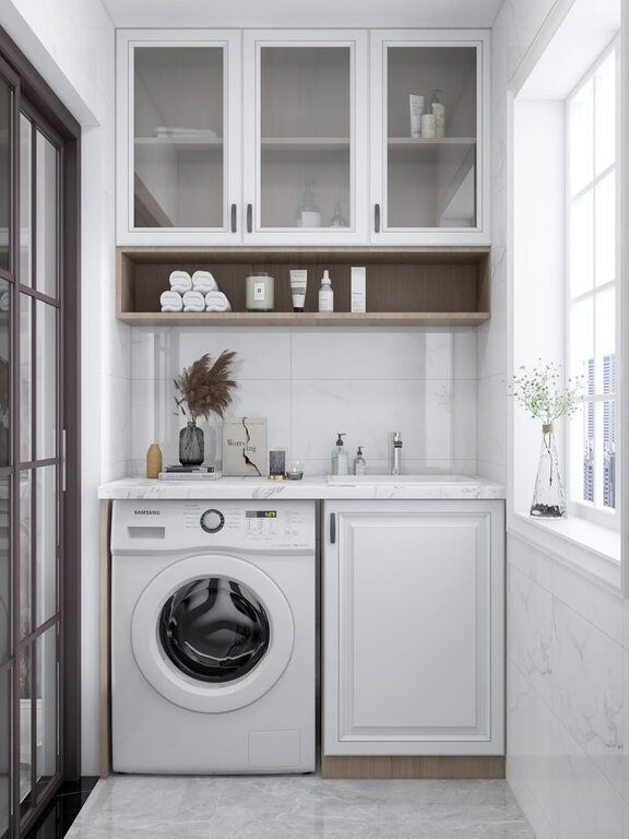
Kitchen and Dining Area
– Lighter shades of green or buttery yellow can stimulate appetite while remaining calm.
– Pair with white or cream cabinets for brightness.
Bathrooms
– Soft aqua or seafoam green evoke cleanliness and tranquility.
– Reflective surfaces like mirrors enhance light with calm hues.
Test Samples on Your Walls
Paint sample patches in different areas of your rooms. Observe them at various times, morning to night. This real-world testing helps you avoid surprises and ensures your chosen colors evoke the desired calm feeling.
Use Color Psychology as a Guide
Here are some popular calm colors and their general effects:
– Blue: Peace, trust, and relaxation
– Green: Renewal, balance, and nature
– Lavender: Serenity and softness
– Beige/Taupe: Warmth and stability
– Gray: Neutrality and calm sophistication
Choose the shades that resonate with you and suit your home’s lighting.
Final Tips for a Calm Color Palette
– Keep it simple—limit your main colors to two or three per room.
– Balance wall colors with furniture and accessories for harmony.
– Incorporate natural elements like plants to complement calm tones.
– Update smaller décor pieces seasonally to freshen the mood without overwhelming changes.
—
Selecting calm colors for your home may seem daunting, but focusing on how hues affect your mood and how light interacts with them will guide you toward the perfect palette. With a thoughtful approach, your home can become a sanctuary filled with peaceful, soothing colors you’ll enjoy every day. Happy decorating!